Situation:
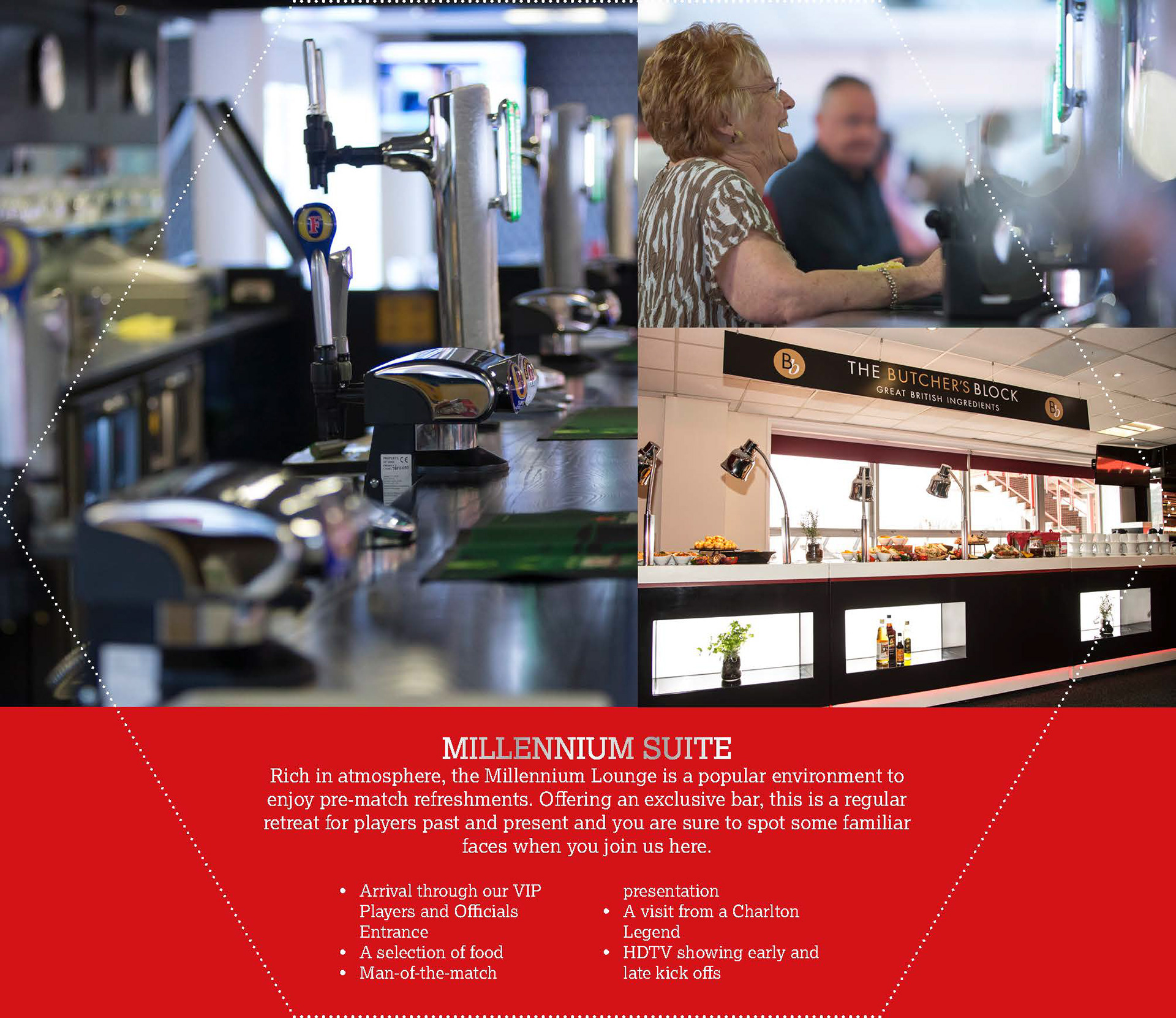
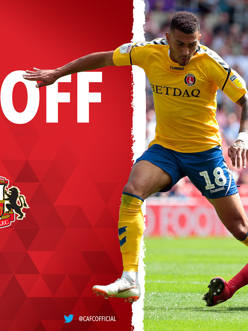
Charlton Athletic needed to promote their 2017/18 matchday hospitality packages to corporate sponsors and VIP guests. The existing brochure format was conventional and flat — it wasn't doing justice to the premium experiences on offer.
Craft:
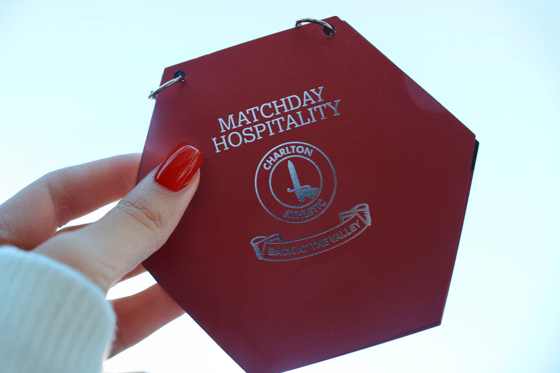
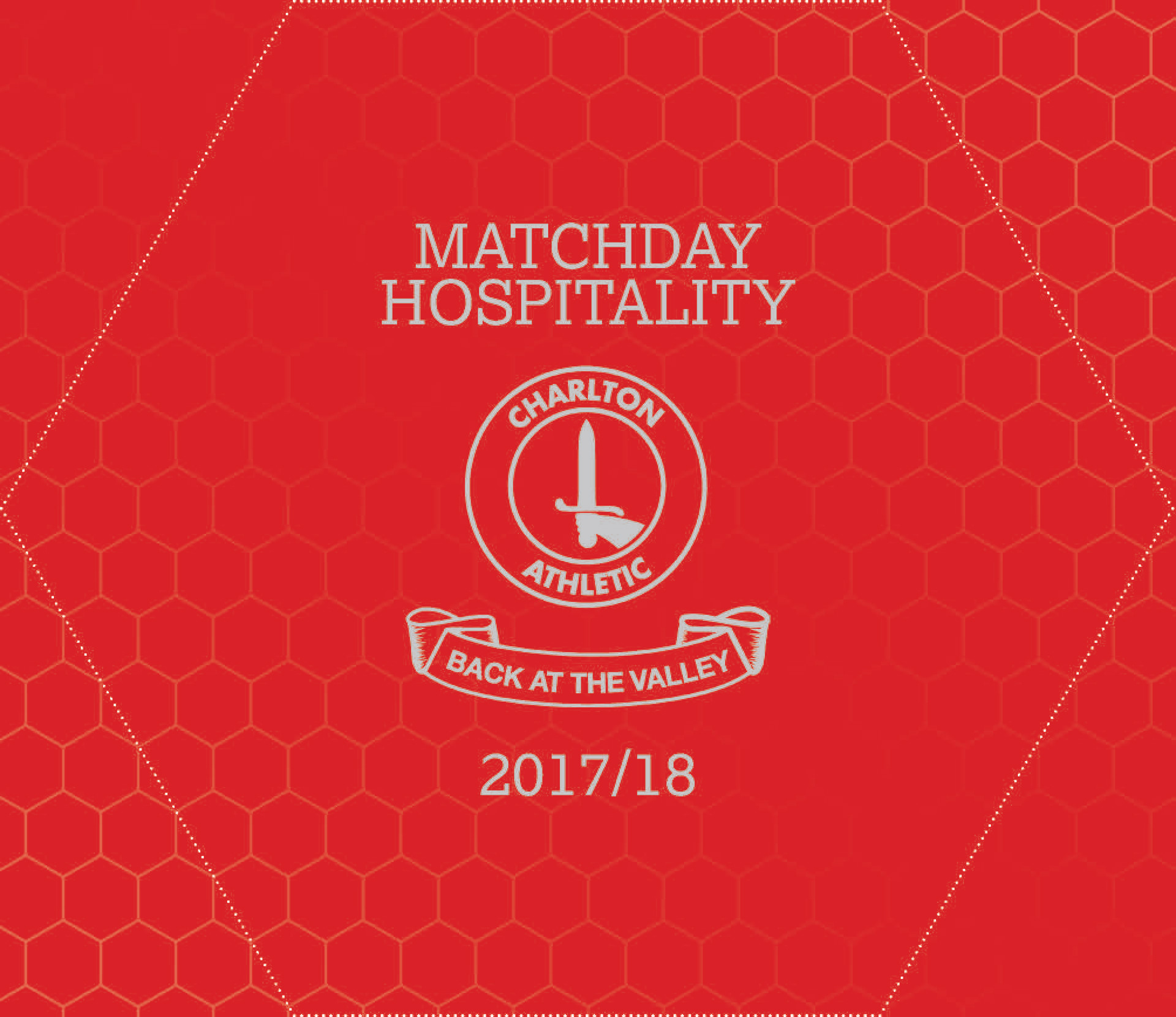
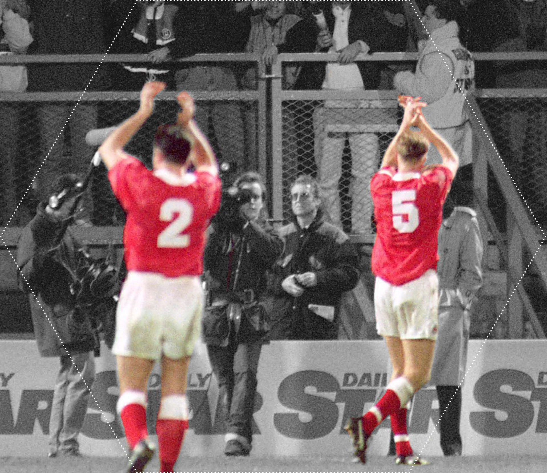
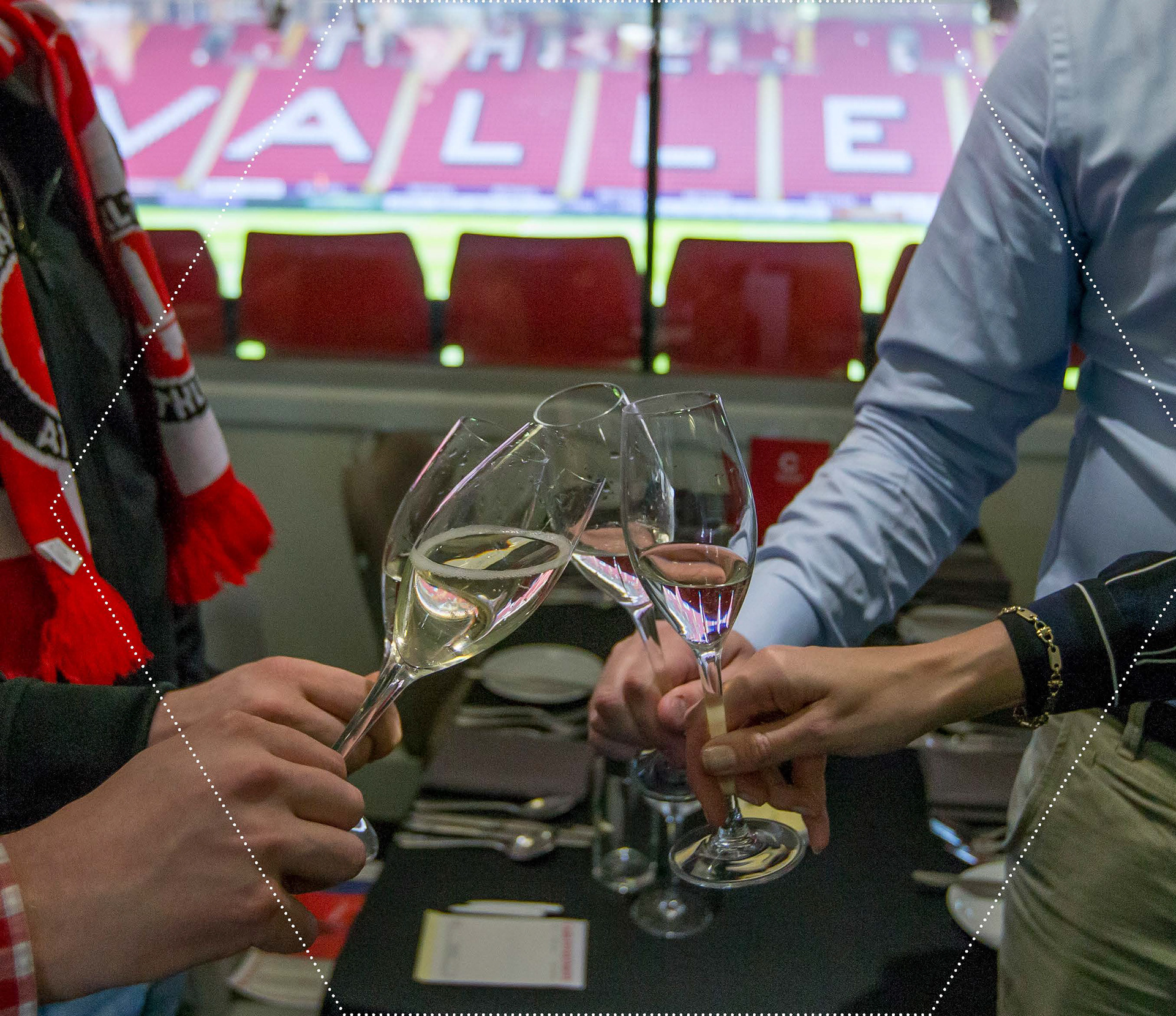
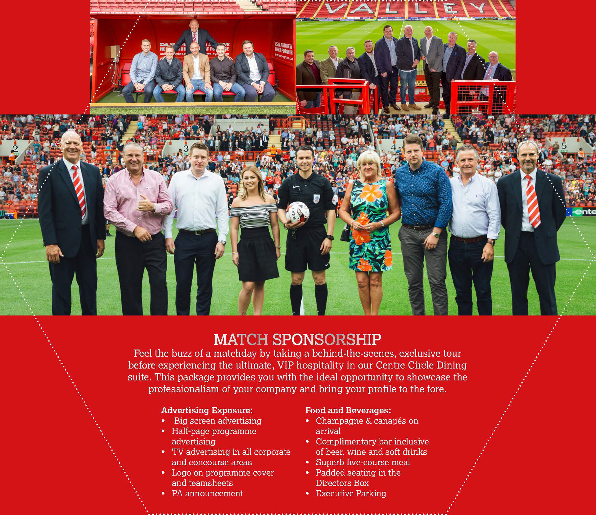
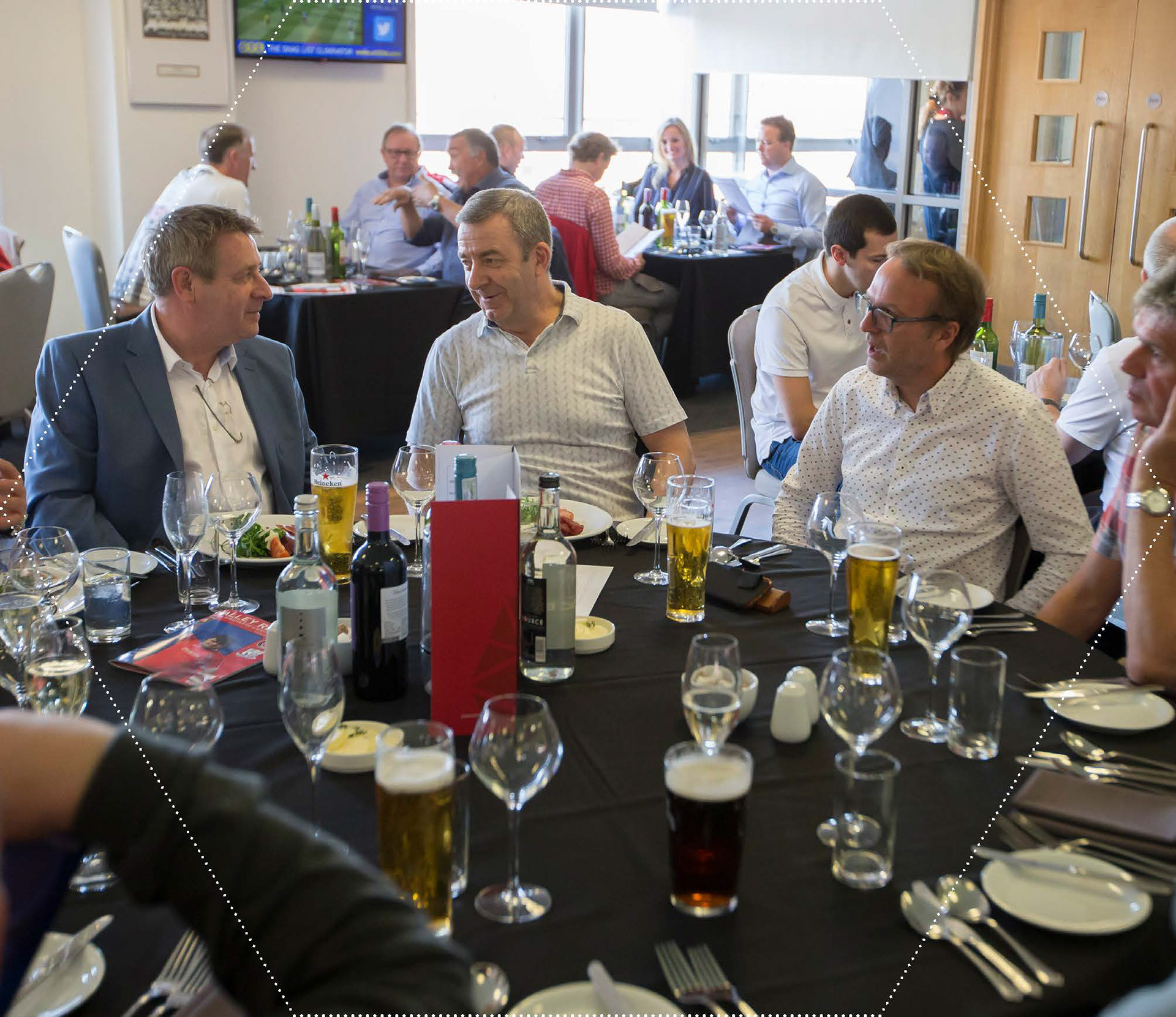
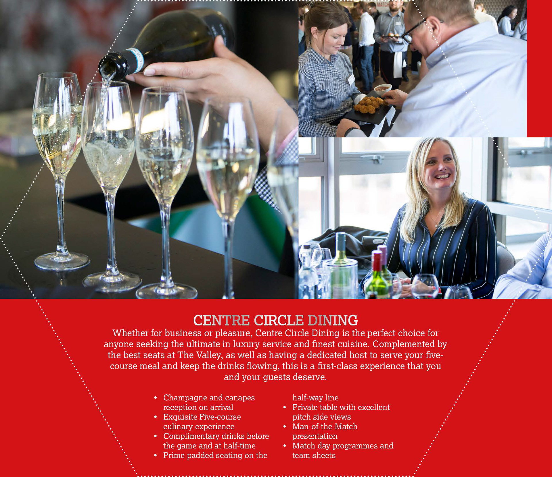
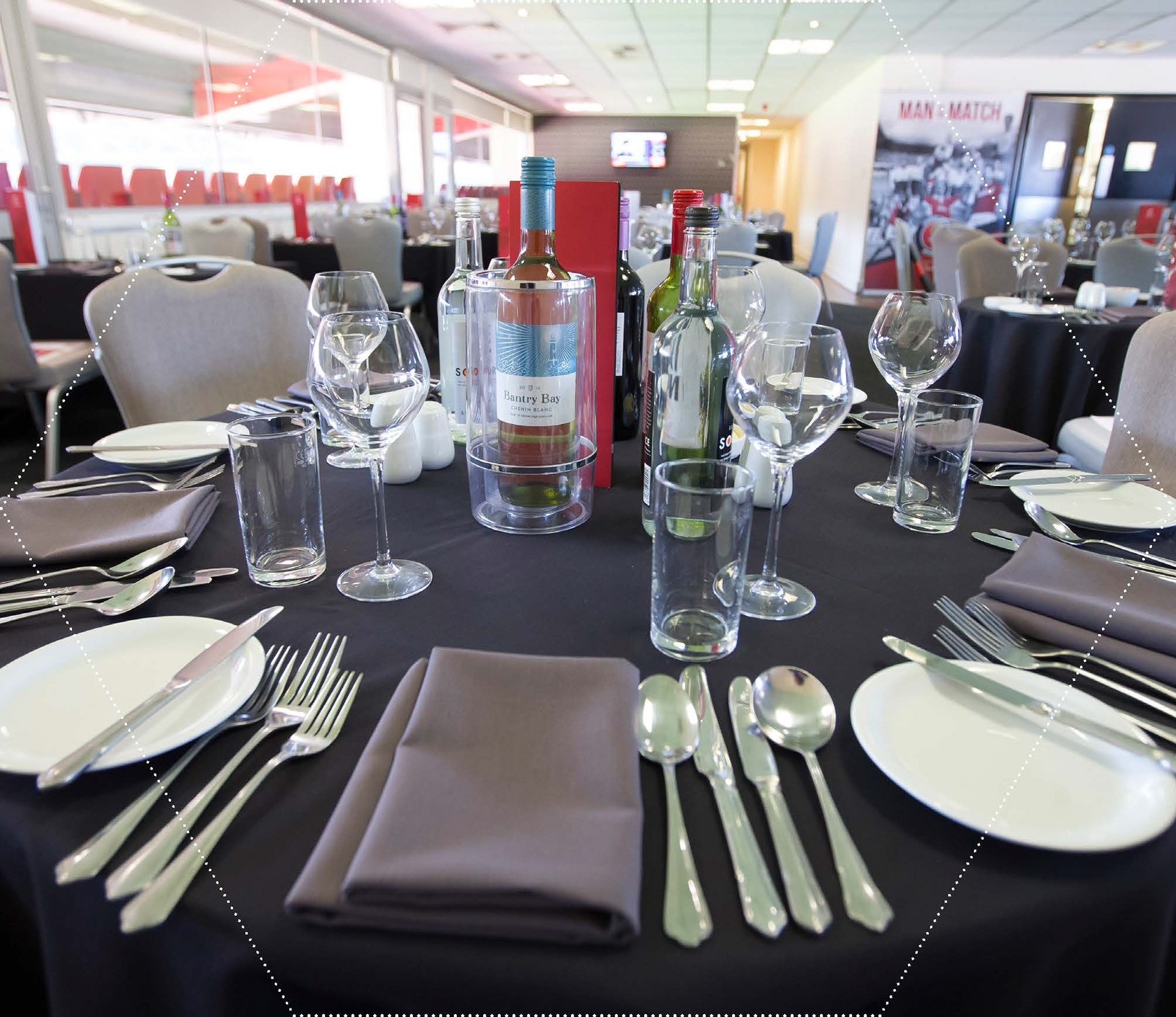
The brief called for something that would stop people in a room, so I looked for the answer in the sport itself. A football's hexagonal geometry became the structural concept: the brochure was physically die-cut into hexagon shapes, with pages connecting in a honeycomb layout that invited handling and exploration. Every layout element — photography, type hierarchy, the red tonal system — was built to make the hospitality packages (Millennium Suite, Executive Boxes, Centre Circle Dining) feel worth the investment.
Impact:
The brochure became a conversation piece among sponsors and VIP guests, praised internally for innovation. It directly contributed to increased hospitality bookings and set a new visual standard for Charlton Athletic's future marketing collateral.